Tuesday 30 July 2013

Tuesday Museday


Tuesday Museday

Tuesdays just became galvanising with a small look at what has been inspiring me this week.


1. Frida Kahlo (src)
2. Indoor plants (src)
3. Pastel macaroon shades (src)
4. Greenery with white backgrounds (src)
5. Palms (src)
6. William Morris patterns (src)
7. Tropical looks (src)
8. Pale colour palettes (src

All of these images in their larger forms can be found via my Pinterest board rather aptly named Tuesday Museday!

Sunday 28 July 2013

Some Recent Art News

The Unveiling of Hahn/Cock

Hahn/Cock unveiled in Trafalgar Square this week.
Src - Standard.co.uk

Hahn/Cock is a sculpture of a big, blue rooster recently installed in London's Trafalgar Square. By German born artist Katharina Fritsch, it was revealed as the latest piece to grace the fourth plinth. 
Upon first impression, I found it hard to understand or to find significance in it. It has been described as a symbol for regeneration which I suppose rings true as the bird stands as a sort of farm-yard phoenix, rising recurrently with the sun each new day and bringing with it, hope. Speaking of days dawning, the famous cockerel on the Kelloggs Cornflakes box springs to mind also (sad that advertising works that well). 
Some have pointed out the French connection leading London's Mayor Boris Johnson to give this (in my view, idiotic) quote:

"I hope French people will not take it as excessive British chauvinism – but for me it stands for the recent British triumph in the Tour de France, which we have won twice in a row … it is a symbol of French sporting pride, brought like a chicken to London. We have mounted this French cock at the heart of our imperial square." - src The Guardian
Are Anglo/Gallic relations really still that bad? 
Another question raised for me was why the blue colour?  Trace back to the artist's other works and a range of sculptures of solid, multi-colours can be found in Fritsch's repertoire, however, choice of colour is very rarely an accident in art. What could the symbolism be here? In a politically minded context and on first viewing, a picture of London's Mayor standing with the artist made me wonder if there were Tory connotations. Perhaps Royal blue was chosen for the birth of the new heir to the throne. The sexual implications ( as it is a very obvious British innuendo, the giant cock) brings the phrase 'blue balls' to mind. Does feminism mean to give the still fertile Patriarchy a vasectomy with a snarky comment on how man sees himself? Fritsch has said about the piece:

"It is a feminist sculpture, since it is I who am doing something active here – I, a woman, am depicting something male. Historically it has always been the other way around. Now we are changing the roles. And a lot of men are enjoying that." - src The Guardian
Add to this idea it's setting, Trafalgar Square. The main attraction there is the 52m high Nelson's Column. Piercing the sky in an inescapably phallic way, it was erected in 1843 in memory of Admiral Horatio Nelson and Hahn/Cock featuring on the fourth plinth is a bold contrast to the serious, grey, male-centric surrounding. It could quite possibly stand to be a comment on how absurd it is in this world striving for equality, for there to be a sculpture of man on a pedestal, as 'master of the hen-house', watching over his domain.

Banksy Removed from Wall for Sale

The Banksy piece before being forcibly removed.
Src - BBC News
I have a soft spot for Banksy. Admittedly before he started sharing his politically thoughtful pieces of stencil graffiti, I was of the impression that spray painted images on walls were an eye-sore and the ruination of other people's property. But since having my eyes opened through visits to different areas featuring this form of expressive media, I now willingly accept it as art and have become a fan of his contemporaries, such as Kid Acne who hails from Sheffield, an area within my locale.
What draws me to Banksy in particular, however, are the ideologies he portrays through his images which fit in well with my own. He has depicted various witty social commentaries on subjects such as the problems that capitalism and authoritarianism brings. Not to mention that they add something exciting to what is usually a grim concrete space.
The piece in question named 'No Ball Games', had been sat happily, admired and also defaced (as is probably to be expected with outside art) in Tottenham since 2012 and to hear that they have removed it for sale irks me. Graffiti is usually in a public space, and therefore can be enjoyed by all. Artworks that are sold are often placed in to private hands where it's viewing audience becomes very limited. In fact I don't really understand how the company behind the sale, the Sincura Group could have said that 'it hadn't been appreciated in situ', how could they possibly know the musing of each passer by of the artwork since it had been in place? Who knows who walked by each day and took humour from the piece. Surely if Banksy, it's creator, had meant it for sale, it would have been presented to the public through different means, perhaps not attached to a stationary wall? 
It could be that I speak out of turn here, as Bansky could admittedly come forward and stop the sale if he felt that it were wrongful and the resulting proceeds are going to charity but personally, I still think graffiti is something which should be admired where it is first placed, in view of all, and open to the elements and the critique of other graffiti artists alike. 


Art is in the Eye of the Beholder: Sculpture Trail Parody

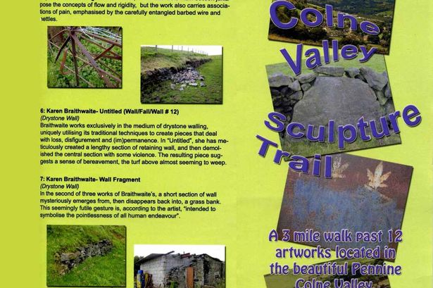
Spoof leaflet advertising the trail.
Src - The Examiner

The above leaflet addressing the 'Colne Valley Sculpture Trail' has been found placed in tourist information venues near Huddersfield. It's supposedly a pamphlet which draws attention to some of the more unattractive features of the area but dressed up as a contemporary art guide. Said features include:

'Wash Behind the Ears' - an abandoned bath
'Impermanent Border' - a line of old fencing
and 'Filled Arch' - basically part of a dry stone wall which wouldn't look out of place at a Andy Goldsworthy exhibition. 

The leaflet makes for a great read even without taking the walk, which could (and apparently has) easily be mistaken for a real environmental art experience.
Whoever put this guide together has created a piece of reading material which is both droll and provokes thought about what modern art has come to mean. I have seen from my own experience of walking around the Tate Modern, artworks which appear to be obscure for the sake of being obscure, with seemingly pretentious names and descriptions. But who is to really say that these pieces aren't art? Now they have been given publicity and a 'meaning', does it mean that these particular features have become what the guide was originally poking fun at? 
If nothing else, the leaflet has in a humorous way, brought to light areas which could possibly use a bit more care and attention around the Colne Valley region.

A printable version of the leaflet can be found on mapfodder.com

Thursday 11 July 2013

Stereohype's 9th Annual Button Badge Design Competition

Yesterday I started designing for the Stereohype Button Badge competition.

I entered a couple of years ago but it was before I really had the equipment that I have now 
and so I don't feel that the designs weren't very impressive.

For this year I didn't have any initial ideas and so I did what I always do when stuck,
I doodled! And that's essentially how the 'ice cream viking' was born. 
Well, food on people's heads soon turned in to food AS people's heads,
which then evolved in to: 

THE BAD APPLES *cue epic guitar riff*


 They're rotten to the core, baby!

However, this design was much too large to fit on to a weenie little badge, 
so I split them in to pairs, which looked like this!


...much better!

But now, I've realised that the writing on these delicious badges may not actually
be legible when it comes to their eventual reduced size!

So it's back to the drawing board for now. 
Though you can probably expect these fruity folk to be appearing as t-shirts and stickers 
via Red Bubble soon.

Altogether I'm happy that I got this illustration out in 1 day, so
I'm pretty sure the next step will be a breeze too.


Tuesday 9 July 2013

I Scream for Ice Cream Vikings.


Drew this because we've had one day of sun in Scotland and that appears to be it.
Had to get in there with a summery drawing while I could...

Monday 8 July 2013

The Notorious Robin Hood

Here's a little mock up I designed by request from one of the Experience Nottinghamshire staff. I've yet to know what's to be done with the image but it was a fun experience to create, quite different to drawing animals, humans are altogether another beast! 


Why I Love Notts - originally published - 25/06/2013


I was recently asked to write a blog entry for Experience Nottinghamshire on my favourite places to go in the region. The piece went live today so like :here: to see what I had to say!

And don't forget to visit Experience Nottinghamshire for what's on, interesting factoids about the area and competitions too!


Fruity Fresh! - originally published: 23/06/2013


This new design is available as t-shirts and stickers! Fresh in time for summer.

Grab one :here:


Link to my Flickr - originally published: 09/06/2013

ROBYNJP FLICKR


Just click the title above and you'll be able to come across various old works of mine. Including, zodiac beermats, #Robinhooding for Experience Notts and Knights of the Round Tumblr illustrations, as well as graffiti and Gary Oldman's face! 


Perpetual Distraction - originally published: 09/06/2013

Recently I was asked to design a logo for an up and coming website about games/wrestling and geeky stuff. Here are my two final designs, which were graciously accepted by the commissioner. 


Release the Hounds - originally published: 08/05/2013

A quick study from my sketchbook for a commissioned piece. I don't think I'll be using these designs for this particular painting, but I like the quirky style and I think I might use them for something else in the future.


Hare I am! - originally published: 04/05/2013


A new t-shirt design by RJP Illustration has arrived! 

I'm working on a few variants of the same design, different animals. 


You can purchase one :here: should you so desire!


Wonderful Wood - originally published: 12/03/2013

The latest artwork that I've completed 'Goldfinch and Bluetit'. I was so happy to have been supplied with a couple more pieces of wood, they were smaller than those I used for the fox and the hare so I knew exactly what I wanted to paint on them. These little birds on some cherry blossom trees were the perfect subject for the pretty offcuts. 


Salmon Moose! - originally published: 27/02/2013


Sometimes I like to draw the first thing that comes in to my head...

Ink and acrylic, digitally rendered.


Roly Poly - originally published: 09/02/2013

'Roly Poly' - acrylic and brusho dye on wood. A commissioned piece.


Space Fox T-shirts Available Right Now!! - originally published: 08/02/2013

This quirky character harks back to my third year at University! He's an ink drawn creation, coloured using Photoshop and he's now available to wear on a t-shirt from Red Bubble. Just click on the link below!


Little Lost Fox - originally posted: 06/02/2013

'Little Lost Fox' is a new piece I've just finished. It's been painted using acrylic and brusho dye on wood and makes quite a cute little accessory/door hanger. 


I am selling these items and they can be customised by choice of animal and a quote or a name can be added into any space left over.

If you would like to commission one, e-mail Robynjp@hotmail.com and tell me what you would like!

Bird Badge - originally posted: 05/02/2013


Just created this sweet little badge, hand sewn and made from fabric. I'm thinking of selling them as I make them and also taking requests from customers as to which bird appears on the badge! 

I might also branch out and make some more colourful, fantasy birds. 


Adventures in Art Nouveau - originally posted: 01/02/2013

Today I've been busy preparing for my work to be featured on a stall at Hodsock Priorycourtesy of Verdant Wildlife. I've screen printed custom art onto some tote bags so that one side has snowdrops (a popular feature of Hodsock) and the other has the Verdant Wildlife logo. It was some hard work with a few mistakes, but I think all in all, they look pretty good. It still needs my own logo putting on there too however.


As I don't normally delve into the floral world, (I'm more fauna) I needed a stylised way of making a pretty piece including the snowdrops, that would look good and wearable on a bag. A quick sketch of some had me drawing curled stalks which were reminiscent of the Art Nouveau style of the early 1900's. It's a style I was taught about in college and something I've always admired. Aubrey Beardsley is an illustrator I adore and a key figure in the movement, which can be recognised by his use of flowing line and natural forms. Perfect for depicting flowers. 

    Through trial and error I came up with the design for the bag above. So much screen printing ensued, 4 different stencils used, 2 colours of ink, all done by hand. I also had a play with creating an image which could be used perhaps as a print for a postcard, which you can see below. 


Very Wild Art - originally posted 30/01/2013

Myself and Verdant Wildlife took a trip to photograph some unusual characters in their natural habitats. These paintings are available to buy I am happy to announce. Just e-mail Robynjp@hotmail.com to find out more.