Friday 13 December 2013

Giving Myself A Helping Hand - an update.

Helping Hand - An Update


I am a late bloomer. There, I finally admitted it to myself. I may have gotten myself a degree but I don't think I took my choices seriously enough. It was drilled in to me for a long time that I had to find my own 'unique visual signature' and the results of that are that I became stuck in a design groove. 

For a long time I only did ink and stick drawings, sure I may have manipulated them using software but I didn't really bypass that process for a long time. So here I am now trying to make up for it and branching out into new areas of creation. Finally.

Slightly off centre logo.
I'm currently planning a revamp of my website and portfolio because I think it's important to re-evaluate where you're at every couple of months, especially when you haven't achieved the goals that you wanted to at this point. I want to build a client portfolio and to network, I want a professional, .co.uk website and I would very much like to start my own magazine/zine. Above is the new logo that I set up using Illustrator the other day, it isn't perfect yet but it may help to explain my pencil inspiration for the week. 

There's a small market my father goes to near my home village and he buys me old copies of magazines such as Computer Arts and Creative Review for cheap, the tips and tutorials in these have been a god send! I feel like I'm learning more processes now through self-teaching than I did in University, though of course I am still rusty. 

Here are a couple of illustrations I've been playing about with using Adobe Creative Suite.

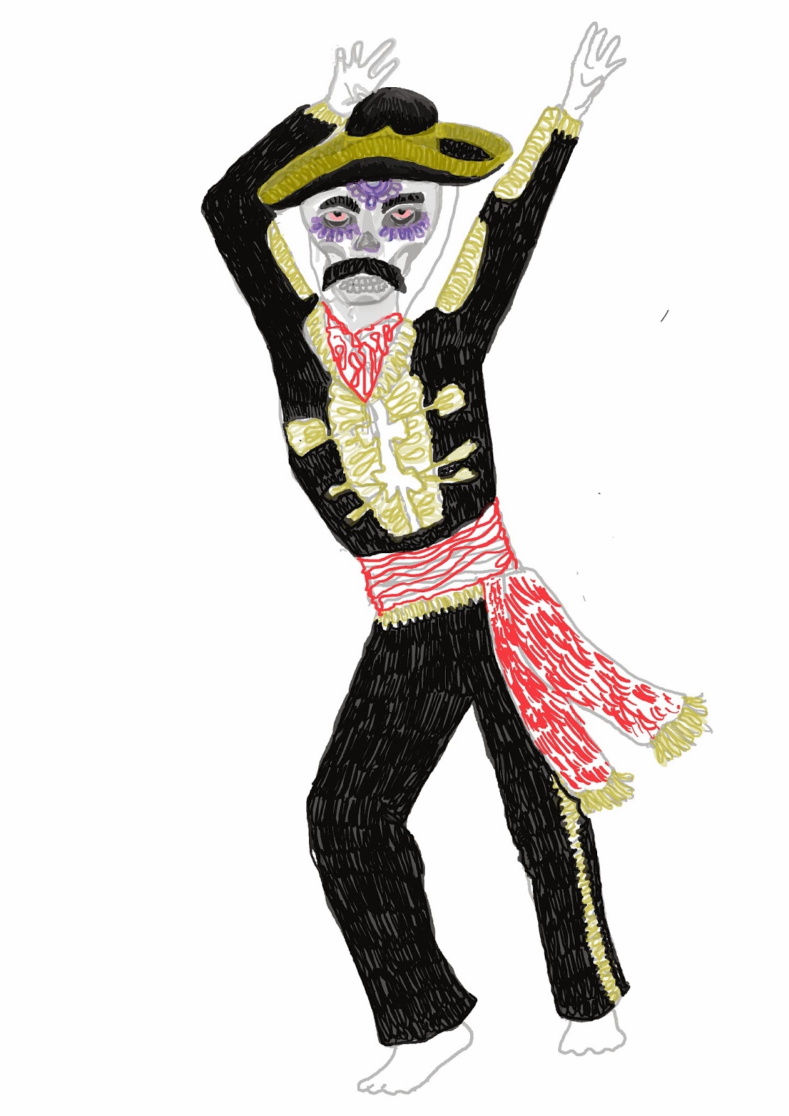
Beginnings of 'Zumbie'


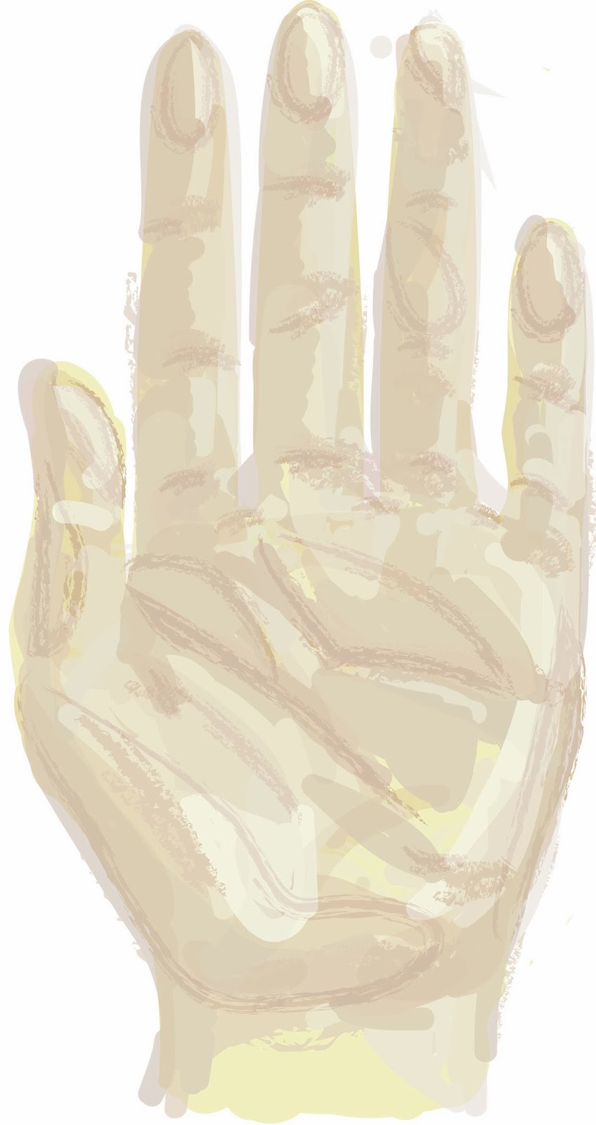
Practice painting in Illustrator
'Zumbie' will be an addition to the dancing monsters illustrations I have yet to finish and the hand was a. computer painting practice for which my hand served as a model, and b. just because I've become slightly addicted to looking at the artwork related to Palmistry, Tarot and Ouija lately. Odd yes, but also there's some quite beautiful stuff out there.

And finally, I have some sweet news just in time to make my Christmas. I was checking an old e-mail account the other night and I realised I'd sold some work! That's right, I've posted it to this blog before, but I have some designs on RedBubble.com and some lovely people out there decided to purchase Pineapple stickers and a Space Fox hoodie! I was equally surprised and happy, so much so that I proceeded to do a little dance around the room. So a huge thank you to whomever bought those and know that the resulting fiver has gone on to fund someone's Christmas present so the good feeling is still being passed around.

Tuesday 20 August 2013

Tuesday Museday - 20/08/2013

Tuesday Museday


  1. Matthew Uebbing sketchbook work (src)
  2. Grand wall designs (src)
  3. Girl Power (src)
  4. Ink wash (src)
  5. Akira Kurosawa/Toshiro Mifune (src)
  6. Colour: figs (src)
  7. Un-traditional doggy portraits (src)
  8. Christmas DIY ideas (src)
So much beautiful dark purple is creeping in this week, I think I'm getting over summer and ready for Autumn/Winter as it's definitely time to start preparing craft/art ideas for Christmas! 

See the larger images here:  the Tuesday Museday Pinterest board!


Sunday 18 August 2013

Some Recent Art News

Art Everywhere

The Lady of Shallott by John William Waterhouse on billboard display.
Src - Art Everywhere 

On August 12th a nationwide exhibition opened to the British public. It was to be known as Art Everywhere, a project funded by donations from ordinary folk and businesses alike, it's primary aim being to bring art out of galleries and to the masses. Where perhaps a hamburger or fashion chain advertisement used to be, now a Millais or a Freud sat. Where once people were being persuaded to go and see the latest blockbuster whilst waiting for the bus, there was now a work by Kapoor or Ofili. 
However, though being billed as one of the biggest exhibitions of it's kind, there seems to have been very little buzz generated for it. On the Art Everywhere website it says that there have been 30,000 Facebook likes and 'over a thousand individual donations' from people 'around the world', which doesn't really seem to be such a substantial contribution. For something which spans from Cornwall to Caithness, you'd have thought that it would have had more backing. 
In addition to this, the reviews from the public haven't exactly been shining. BBC News reported that it had asked people around the UK what they thought of the project and how they felt about seeing art outside of galleries. Whilst speaking to someone sitting next to David Hockney's 'A Bigger Splash' at a bus stop, they were given this response:
Asked how it compares with images that usually appear on bus stops, he points out that Hockney is in competition with normal adverts that are still dotted around. "It just blends in," he says. "The first thing that grabs your attention [with an ad] is the text. - src
A very valid point, in a world already overcome with images, how would someone be able to tell what is classed as 'art' when it is sat beside pictorial advertisements? This view certainly seems to support the idea for galleries, however, it was also reported that he said 'he was not in to art and does not know what to think of the picture'. 
Reading this, I wondered why people felt such a disconnection to art and why this particular idea of making art more accessible wasn't being viewed with more excitement. Was it because of a bad advertising campaign for Art Everywhere that there had been such a lacklustre reaction? Or could the reason behind the meagre donations be because the British public just isn't that interested in the subject as a whole? Though there had been a couple of days of #art trending on Twitter which may have been due to the exhibition, there didn't appear to be much of a fanfare for such a big project.
Personally, I have always seen art as a way for humans (no matter their technical skill or background) to express themselves and to share and relate those feelings with other people, but there appears to be a distinct undercurrent of elitism and pretension which possibly gives people, like the young man above, the view that art isn't for them. He could of course just genuinely be uninterested in art, but it's such a broad and ranging subject that I find this hard to believe and even harder to believe that he wouldn't have at least had some opinion on a piece. 
When you think about who owns some of the originals of the artworks on display, there remains the idea that only the very rich can afford them, and that the most accepted way to judge what makes 'good art' is via the choice of wealthy collectors and critics. Perhaps due to this people feel disengaged from 'high art' and are eliminated from having their own views because of snobbery and fear of 'having the wrong interpretation'. 
By bringing art to a wider audience could Art Everywhere break down these barriers? Hopefully the pictures will provoke new found interest and bring more people in to galleries, or at the very least give them more ability, out in the open, to express their opinion on pieces, away from the denigrating looks of those who think they know better.


Recommended read: Emin and Lucas - The Shop

Tracey Emin and Sarah Lucas were part of the Young British Artists group of the 1990s. They became two of my favourite artists, due to the openness and down-to-earth attitudes visible in their works. Through these works, Emin would 'speak' in a revealing and honest way, that some found shocking, about past relationships and Lucas came up with some simply fantastic feminist critiques on how women were viewed, one of my favourites being, 'Bitch'.

'Bitch' (1994)
Src - Artnet.com
And although they may have been the protégé of Saatchi, it didn't stop Emin turning up drunk to a talk on Channel 4 with other more humourless, out of touch members of the art-world as an enfant terrible, and practically telling them to fuck off because she was going to spend time with people who she actually liked and related to. 
I was therefore very interested in this recent article via the Guardian where Emin and Lucas wrote about their experiences with 'The Shop', a place which they owned and sold works from, in London in 1993. They would create somewhat controversial and puerile items that reflected the upcoming rise of post modernism and 'ladette' culture, and then sell them for the price of their 'next pack of cigarettes' or their next rental bill for the shop.
'We drew labels on ribbons that said "Help me" and "So boring". They went inside your coat, attached with safety pins. When you were out and got trapped in a difficult conversation, you could flash the label to a friend to get help. They cost 50p.' -src
It's amazing to think how much this sounds like a precursor to Etsy, quirky, hand-crafted items going for cheap. 
Though popular, it mainly served as a place for Emin and Lucas to socialise and 'The Shop' eventually went out with a bang after a 'massive, crazy closing party'. 
I'm going to stop here because the words sound so much better coming from the artists themselves and I would recommend reading this article for yourself because not only is it fascinating, but it also serves as a reminder that art shouldn't just be about the commercial, how famous you can become or taking everything seriously but that it's also good to create, to commune and share and to have as much fun as possible doing it. 

Saturday 17 August 2013

Illustration Friday - 10/08/2013 - Fresh!

Illustration...Saturday? 

So last week the word that was announced for Illustration Friday was 'Fresh'. I've been behind all week due to various happenings, so I'm afraid my attempt wasn't very explored at all. I didn't even manage to do much sketchbook work! Oops! Here's what I ended up with and hopefully I'll work extra hard this week to make up for it.

I'm very interested at the moment in making patterns as I've got a few secret plans for the future which will require some skill in this area, so I took that route.

I didn't start out by looking at the word Fresh this week, I just went with what popped in to my mind first, something which I tackled a while back - Pineapples. 

Here's one I made earlier...
There's something about a big yellow, tropical pineapple that evokes freshness and Summer and they seem to have been quite popular within Internet communities lately. So to start, some very quick, mediocre sketching at the beginning of this week and then not much progress again until Thursday. Thankfully this wasn't due to laziness but because I have had other pieces in the works.

An amalgamation of the sketching I did.
There were a few different concepts that I came up with before this one took hold. Perhaps at this point to enhance the 'fresh' idea I could have added in some  juice spurts and made it a bit more dynamic rather than the very obvious wording I placed on top. I was unsure as to how this would translate to a pattern also. 

First attempt at arranging this idea in to a pattern.
I changed the positioning of the pineapple so that it went sideways which I think was an attractive composition. However, the downfall to this pattern came when I added the dots in the background. I wanted to incorporate a kitsch 1950's look and used some of my sketches outside of the cut-up pineapple to create this cute dotty fill effect but the two ideas just didn't mesh in this instance.

Pineapple chunks.
Pineapple rings.


I guess I managed a bit more exploration of the idea than I let on as I tried out using just parts of the pineapple and not the whole thing. The chunks idea ended up reminding me too much of sweetcorn, it seemed too far away from the original to be recognisable. With the addition of rings, it becomes a bit more readable but it's very dull. A possible use for these would be as the front/back cover pages of a book!

Photoshop - define pattern and fill.
I ended up going back to the original design, but without the wording, and arranged the rings in a dynamic way so that it looked as if the pineapple was slowly splitting apart, one ring at a time. The addition of extra, yet uncoloured pattern brings the coloured parts to the forefront and gave the picture some depth. 

A3 version, allowing more of the pattern to be shown.
Here was where the pattern ended up. I think it would make some lovely gift wrap, perhaps the spacing could be worked out as there does appear to be a lot of it and there is definitely some room for improving/playing with colours but it does have a 'fresh' aesthetic and some of the retro-look, it makes a good starting point. 

The word for next week is - POWER! 

Saturday 10 August 2013

5 things I Love: Illustration

5 Things I Love: Illustration


Okay so I suppose that this might be a slightly self-indulgent post but I know what I like and I want to share it. If I knew what you like, dear reader, then I would post that but unfortunately we have yet to be introduced! (Seriously, talk to me, leave me comments!)

It's 12 midnight and I've been on different websites all day looking at all things related to my favourite thing in the world: ILLUSTRATION, duh! Here are the results of the days findings, these aren't in order of best-worst/worst-best though.

(Disclaimer: the following are here due to my own opinions, not everyone is inclined to agree.)

Things I love no. 5:

Josephine Baker illustrated iPhone case: Have you seen this? Click the link if you haven't. Not everyone may find the joy that I do in looking at Miss Baker (I don't understand how you can't but let's be friends anyway) but even if you aren't a fan (seriously? no?) then just admire how lovely this illustration is anyway, how it captures art deco and how there's the hidden gem of a dancing Baker in the pattern on the fan Farah Allegue has created. It's on my 'to buy' list, which only usually gets longer and never shorter as I rarely have money.

Things I love no. 4:

Kris Atomic's blog: I will love this forever and always. It's so bright, pretty and full of things that make my eyes go WOW! Kris is a true artisan of the craft and beauty just seems to follow her around.

Things I love 3:

 Src - TimmyTebs
Illustration by M. Sasek (1959)

This is... by M. Sasek: Do I love illustration? Yes! Have you not been listening? Do I love Travel? Yes! Do I love the 'This is...' series by M. Sasek? YES! Stunning children's books about different places in the world. I got the one about London a couple of Christmases ago and I hold it very dear. In particular, the tube illustration makes my heart melt. Ah London. It's possibly a little bit outdated now with it's nannies and men in bowler hats (it was first published in 1959) but it's so charming that it automatically stands the test of time and stays awesome. And as a bonus, if you ever look inside 'This is the way to the Moon' there's a chimp in a spacesuit! 

Things I love 2:

Pretty much everything on the Illustration board by Rowen and Wren on Pinterest. OH MY DAYS, I am both envious of the talent and drooling over the prettiness on this board. I actually follow all of the Rowen and Wren boards because they all have quality pins but their choice in illustration is amazing. The drawings by Katt Frank are my favourite, they are so delicate and involve food which is a gigantic plus. 

Things I love 1:

Chatting to/seeing what other illustrators get up to via Twitter! I don't get all that much chance to do it because we're a busy lot (and I am quite shy) but every now and then I like to drop them a tweet or two or favourite something they've been up to. It's good to keep up to date with what my contemporaries are doing and share a friendly word. 

THE END! Check out the links I've added, I promise you won't be disappointed. And drop me a comment or a tweet and tell me about you! Thanks for reading.


Tuesday 6 August 2013

Andy Warhol; More than Meets the Artist

A Closer Look at Warhol

Andy Warhol was most famous for his being at the forefront of the Pop Art movement and for his multi-coloured screen prints of the icons of his epoch. But being an illustrator myself, I was always most fascinated by the fact that he was advertiser and illustrator before artist. 

So while most people would have perhaps seen his work; 'Campbell's Soup Can' (which was an advert in itself), or the peeling banana of the 'Velvet Underground & Nico' LP cover, many of his earlier pieces may have been slightly under appreciated. And although he doesn't really need anymore exposure being one of the best known artists of all time, I'd like to share some of my favourites with you for the anniversary of what would have been his 85th birthday.

Warhol's journey to great fame was launched by his being hired to draw pictures for the advertisement of shoes, record covers and other promotional material. This business brain combined with knowledge of printmaking techniques certainly would have paved the way for his later distinctly commercial and accessible, high art creations not to mention the idea of brand advertising. 


Female Costumed Full Figure 1950's
(src)

Shoes 1959
(src)
Cover for a book of fashion drawings
by Warhol, this slender figure is very art deco and
shows his trademark 'blotted line' style.
(src)

An advert for Tiffany's (and my favourite.)
(src)


Happy birthday Andy!


Tuesday Museday

It's Inspiration time!


  1. French Bulldogs (src)
  2. The Talented Mr. Ripley (src)
  3. Animal/Human mythology (src)
  4. Classy cocktails (src)
  5. The palette of a Black Forest Gateaux (src)
  6. Edvard Munch sketches (src)
  7. Sara Fanelli's illustration (src)
  8. The Riot Grrrl Collection (src)
It's a mixed bag this week but that's because I've had a few different projects on the go!
(I wish real cocktails were involved but instead I've been under the influence of how beautiful and artisan cocktails can look.)

Again, all of these pins and last weeks can be found on the Tuesday Museday Pinterest board!

Thursday 1 August 2013

Illustration Friday 26/07/13 - "Jungle"

Illustration Friday - "Jungle"


For anyone who doesn't know Illustration Friday is a website which provides weekly creative inspiration. A word is chosen every Friday and then you are asked to produce a piece of artwork connected to it. The connection could be very loose and you can use whatever media you like! I've always found it to be quite a fun way of coming up with new ideas if I'm stuck in my own artistic routines.

The word posted last Friday was "Jungle" and it has been something that I have worked on over this past week, I'm posting my results here today in preparation for a new word tomorrow (and also to prove to myself that I can deal with deadlines!).

Firstly, I started with some research into the definition of the word Jungle. 

jun·gle  

/ˈjəNGgəl/
Noun
  1. An area of land overgrown with dense forest and tangled vegetation, typically in the tropics.
  2. A wild tangled mass of vegetation or other things. (src)
My findings ranged from depictions of the Rainforest, 'urban' and 'concrete' jungles and even to songs i.e. 'Welcome to the Jungle'. After this I began some initial early morning (read 2 a.m.) sketching using watercolour pencil.

Flowers of the rainforest - sketchbook edition.

The flora of the Rainforest really grabbed my attention as they tend to be bright and attractive to the eye, the large flowers and entanglement of vines also reminded me of the entwining natural designs of William Morris' wallpapers and thus led me to my next few sketches, determining a pattern of my own. 


Scans of the pen drawings of flowers
ready for arrangement in Photoshop.
My flowers are quite simplified and drawn in Berol pen into a sketchbook and then scanned on to the computer for the design to be completed digitally. I have other sketches for different ideas from this week, but this was the one that I focussed in on.

What would come to be the final Layout
with first set of added colours.
This was the result of some initial experimentation. Not quite a twisting Morris pattern but an attractive set up. My first colour choices didn't seem exactly right, and I found it to be the most challenging aspect of the piece. One thing I did take from the trial and error was the idea of surrounding lines of darker colours rather than leaving them as black ink as I didn't want a cartoonish look for the design. The hummingbird actually comes from a drawing I created before as the illustration to a poem by D H Lawrence.

Second colour change.

Here I tried adding darker and lighter parts to give more contrast but the colour palette still didn't seem right. 

Shapely design.

The picture above was a bit of a happy accident whilst fixing the outlines. It has a tropical feel which suits the subject matter nicely and the graphic shapes would possibly make a great t-shirt design.

Looking much better.

Eventually, after a little more experimentation, this is the design which I felt fixed all the things that I was hoping to change before. I toned down the colour palette a lot so that it wasn't quite so garish. The greens are perfect for a jungle theme and the pink adds a nice tropical contrast. The white outline lifted the picture off the page and I am a fan of the offset look. The weakest parts for me are probably the pokers in the background which needed some assemblage in photoshop and could have done with a re-draw.

So there you have it, my Illustration Friday entry. Finished by midweek and with a few designs I can use for other things. Including the one below, I was very happy with how the palm fan worked out and it looks like I could still get my Morris design from this yet.

The beginnings of a pattern using scans of the large
Palm Fan that I drew for the centre of my design.


A few of my favourite entries from this week:


Please click the links below the pictures to check out more of each artists work. 
Note: I am not taking credit for any of these, just showing admiration.

Entry by Skim Milk


Entry by Katherine Wisdom


Entry by Revelle Taillon


Tuesday 30 July 2013

Tuesday Museday


Tuesday Museday

Tuesdays just became galvanising with a small look at what has been inspiring me this week.


1. Frida Kahlo (src)
2. Indoor plants (src)
3. Pastel macaroon shades (src)
4. Greenery with white backgrounds (src)
5. Palms (src)
6. William Morris patterns (src)
7. Tropical looks (src)
8. Pale colour palettes (src

All of these images in their larger forms can be found via my Pinterest board rather aptly named Tuesday Museday!

Sunday 28 July 2013

Some Recent Art News

The Unveiling of Hahn/Cock

Hahn/Cock unveiled in Trafalgar Square this week.
Src - Standard.co.uk

Hahn/Cock is a sculpture of a big, blue rooster recently installed in London's Trafalgar Square. By German born artist Katharina Fritsch, it was revealed as the latest piece to grace the fourth plinth. 
Upon first impression, I found it hard to understand or to find significance in it. It has been described as a symbol for regeneration which I suppose rings true as the bird stands as a sort of farm-yard phoenix, rising recurrently with the sun each new day and bringing with it, hope. Speaking of days dawning, the famous cockerel on the Kelloggs Cornflakes box springs to mind also (sad that advertising works that well). 
Some have pointed out the French connection leading London's Mayor Boris Johnson to give this (in my view, idiotic) quote:

"I hope French people will not take it as excessive British chauvinism – but for me it stands for the recent British triumph in the Tour de France, which we have won twice in a row … it is a symbol of French sporting pride, brought like a chicken to London. We have mounted this French cock at the heart of our imperial square." - src The Guardian
Are Anglo/Gallic relations really still that bad? 
Another question raised for me was why the blue colour?  Trace back to the artist's other works and a range of sculptures of solid, multi-colours can be found in Fritsch's repertoire, however, choice of colour is very rarely an accident in art. What could the symbolism be here? In a politically minded context and on first viewing, a picture of London's Mayor standing with the artist made me wonder if there were Tory connotations. Perhaps Royal blue was chosen for the birth of the new heir to the throne. The sexual implications ( as it is a very obvious British innuendo, the giant cock) brings the phrase 'blue balls' to mind. Does feminism mean to give the still fertile Patriarchy a vasectomy with a snarky comment on how man sees himself? Fritsch has said about the piece:

"It is a feminist sculpture, since it is I who am doing something active here – I, a woman, am depicting something male. Historically it has always been the other way around. Now we are changing the roles. And a lot of men are enjoying that." - src The Guardian
Add to this idea it's setting, Trafalgar Square. The main attraction there is the 52m high Nelson's Column. Piercing the sky in an inescapably phallic way, it was erected in 1843 in memory of Admiral Horatio Nelson and Hahn/Cock featuring on the fourth plinth is a bold contrast to the serious, grey, male-centric surrounding. It could quite possibly stand to be a comment on how absurd it is in this world striving for equality, for there to be a sculpture of man on a pedestal, as 'master of the hen-house', watching over his domain.

Banksy Removed from Wall for Sale

The Banksy piece before being forcibly removed.
Src - BBC News
I have a soft spot for Banksy. Admittedly before he started sharing his politically thoughtful pieces of stencil graffiti, I was of the impression that spray painted images on walls were an eye-sore and the ruination of other people's property. But since having my eyes opened through visits to different areas featuring this form of expressive media, I now willingly accept it as art and have become a fan of his contemporaries, such as Kid Acne who hails from Sheffield, an area within my locale.
What draws me to Banksy in particular, however, are the ideologies he portrays through his images which fit in well with my own. He has depicted various witty social commentaries on subjects such as the problems that capitalism and authoritarianism brings. Not to mention that they add something exciting to what is usually a grim concrete space.
The piece in question named 'No Ball Games', had been sat happily, admired and also defaced (as is probably to be expected with outside art) in Tottenham since 2012 and to hear that they have removed it for sale irks me. Graffiti is usually in a public space, and therefore can be enjoyed by all. Artworks that are sold are often placed in to private hands where it's viewing audience becomes very limited. In fact I don't really understand how the company behind the sale, the Sincura Group could have said that 'it hadn't been appreciated in situ', how could they possibly know the musing of each passer by of the artwork since it had been in place? Who knows who walked by each day and took humour from the piece. Surely if Banksy, it's creator, had meant it for sale, it would have been presented to the public through different means, perhaps not attached to a stationary wall? 
It could be that I speak out of turn here, as Bansky could admittedly come forward and stop the sale if he felt that it were wrongful and the resulting proceeds are going to charity but personally, I still think graffiti is something which should be admired where it is first placed, in view of all, and open to the elements and the critique of other graffiti artists alike. 


Art is in the Eye of the Beholder: Sculpture Trail Parody

Spoof leaflet advertising the trail.
Src - The Examiner

The above leaflet addressing the 'Colne Valley Sculpture Trail' has been found placed in tourist information venues near Huddersfield. It's supposedly a pamphlet which draws attention to some of the more unattractive features of the area but dressed up as a contemporary art guide. Said features include:

'Wash Behind the Ears' - an abandoned bath
'Impermanent Border' - a line of old fencing
and 'Filled Arch' - basically part of a dry stone wall which wouldn't look out of place at a Andy Goldsworthy exhibition. 

The leaflet makes for a great read even without taking the walk, which could (and apparently has) easily be mistaken for a real environmental art experience.
Whoever put this guide together has created a piece of reading material which is both droll and provokes thought about what modern art has come to mean. I have seen from my own experience of walking around the Tate Modern, artworks which appear to be obscure for the sake of being obscure, with seemingly pretentious names and descriptions. But who is to really say that these pieces aren't art? Now they have been given publicity and a 'meaning', does it mean that these particular features have become what the guide was originally poking fun at? 
If nothing else, the leaflet has in a humorous way, brought to light areas which could possibly use a bit more care and attention around the Colne Valley region.

A printable version of the leaflet can be found on mapfodder.com

Thursday 11 July 2013

Stereohype's 9th Annual Button Badge Design Competition

Yesterday I started designing for the Stereohype Button Badge competition.

I entered a couple of years ago but it was before I really had the equipment that I have now 
and so I don't feel that the designs weren't very impressive.

For this year I didn't have any initial ideas and so I did what I always do when stuck,
I doodled! And that's essentially how the 'ice cream viking' was born. 
Well, food on people's heads soon turned in to food AS people's heads,
which then evolved in to: 

THE BAD APPLES *cue epic guitar riff*


 They're rotten to the core, baby!

However, this design was much too large to fit on to a weenie little badge, 
so I split them in to pairs, which looked like this!


...much better!

But now, I've realised that the writing on these delicious badges may not actually
be legible when it comes to their eventual reduced size!

So it's back to the drawing board for now. 
Though you can probably expect these fruity folk to be appearing as t-shirts and stickers 
via Red Bubble soon.

Altogether I'm happy that I got this illustration out in 1 day, so
I'm pretty sure the next step will be a breeze too.


Tuesday 9 July 2013

I Scream for Ice Cream Vikings.


Drew this because we've had one day of sun in Scotland and that appears to be it.
Had to get in there with a summery drawing while I could...

Monday 8 July 2013

The Notorious Robin Hood

Here's a little mock up I designed by request from one of the Experience Nottinghamshire staff. I've yet to know what's to be done with the image but it was a fun experience to create, quite different to drawing animals, humans are altogether another beast! 


Why I Love Notts - originally published - 25/06/2013


I was recently asked to write a blog entry for Experience Nottinghamshire on my favourite places to go in the region. The piece went live today so like :here: to see what I had to say!

And don't forget to visit Experience Nottinghamshire for what's on, interesting factoids about the area and competitions too!


Fruity Fresh! - originally published: 23/06/2013


This new design is available as t-shirts and stickers! Fresh in time for summer.

Grab one :here:


Link to my Flickr - originally published: 09/06/2013

ROBYNJP FLICKR


Just click the title above and you'll be able to come across various old works of mine. Including, zodiac beermats, #Robinhooding for Experience Notts and Knights of the Round Tumblr illustrations, as well as graffiti and Gary Oldman's face! 


Perpetual Distraction - originally published: 09/06/2013

Recently I was asked to design a logo for an up and coming website about games/wrestling and geeky stuff. Here are my two final designs, which were graciously accepted by the commissioner. 


Release the Hounds - originally published: 08/05/2013

A quick study from my sketchbook for a commissioned piece. I don't think I'll be using these designs for this particular painting, but I like the quirky style and I think I might use them for something else in the future.


Hare I am! - originally published: 04/05/2013


A new t-shirt design by RJP Illustration has arrived! 

I'm working on a few variants of the same design, different animals. 


You can purchase one :here: should you so desire!


Wonderful Wood - originally published: 12/03/2013

The latest artwork that I've completed 'Goldfinch and Bluetit'. I was so happy to have been supplied with a couple more pieces of wood, they were smaller than those I used for the fox and the hare so I knew exactly what I wanted to paint on them. These little birds on some cherry blossom trees were the perfect subject for the pretty offcuts. 


Salmon Moose! - originally published: 27/02/2013


Sometimes I like to draw the first thing that comes in to my head...

Ink and acrylic, digitally rendered.


Roly Poly - originally published: 09/02/2013

'Roly Poly' - acrylic and brusho dye on wood. A commissioned piece.